What should designers look out for this year in the areas of UI (User Interface) and UX (User Experience)? Which trends will dominate and how can they be used? Our Communication Design Chapter took a closer look at this year’s UI-/UX-trends and prepared a short summary.
Creating an attractive user interface on a website or app is a core requirement for users to interact with content in the first place. Web designers have multiple choices here. To have an overview, here are the most significant elements in UX-/UI-design for 2023.
Hyperpersonalized Content
So-called hyperpersonalization uses real-time user behavior to determine how the website or app should subsequently interact with users. Hyperpersonalized content allows users to see exactly what they want to see (whether consciously or subconsciously) at a time when they are most likely to take action based on the content. By displaying only relevant content, the conversion rate increases. Website content is specifically tailored to individual users, in terms of their interests, devices, and frequency of use. The rule of thumb here: The website or app has eight seconds to show users something that arouses their interest. This is the only way to keep them on the page and prevent them from clicking away. Hyperpersonalization will be one of the leading UX-/UI-trends this year and will find its way into numerous marketing strategies, among others.
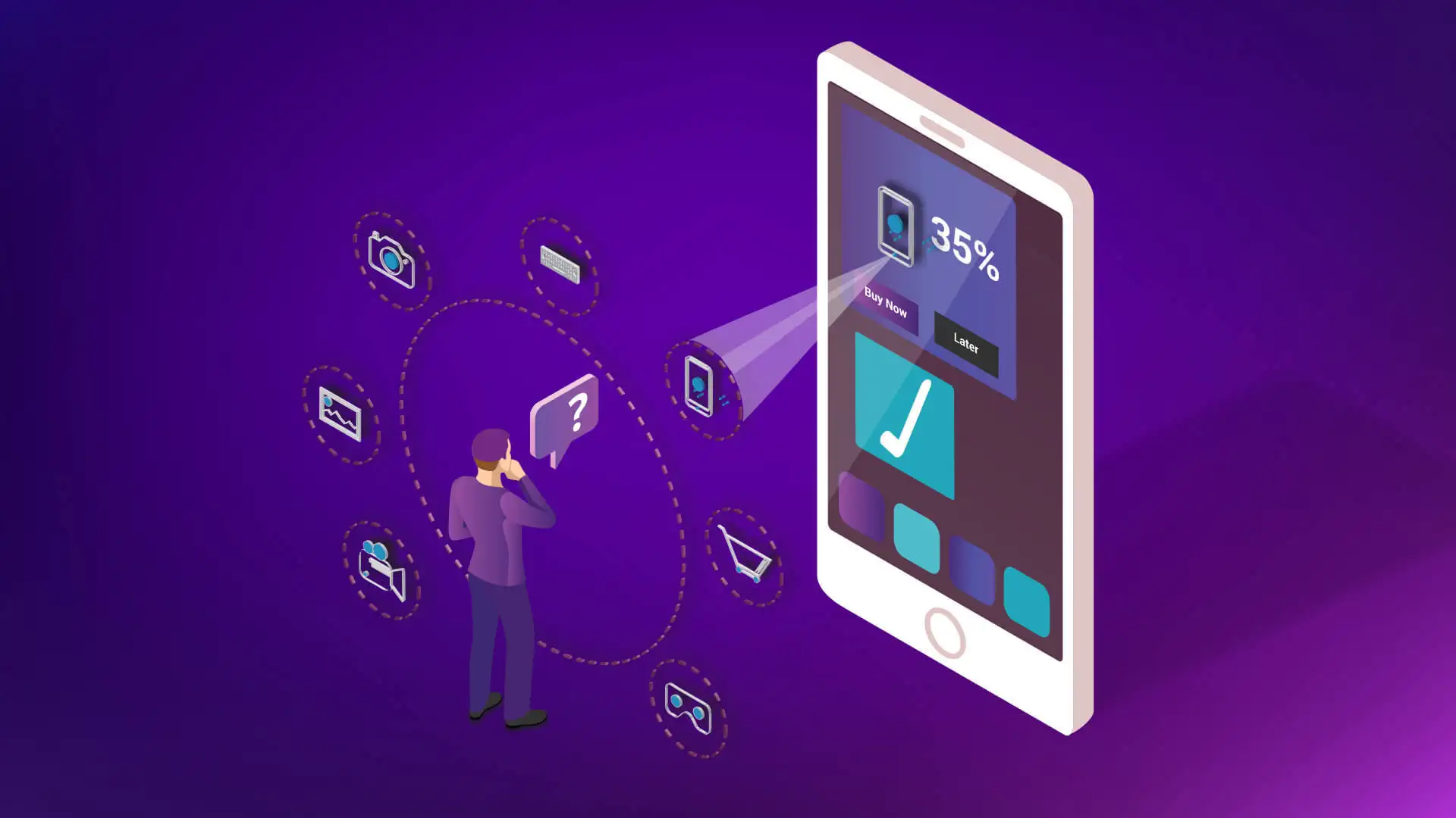
Picture from electricenjin.com
Bold Colors

Bold colors have become a must in web design this year.
The ability to use colors effectively is a basic requirement for anyone working with visual compositions, including illustrators and UI-designers. With the increasing popularity of flat and material design, the knowledge of color-theory has become even more important. Bold colors and gradients can now be found in the user interfaces of various, digital products: from playful and entertaining products to websites. Colors have their own hierarchy, defined in terms of their effect on the user’s mind. There are strong colors like red and orange, but also weak colors like white and cream. Bright colors are easy to recognize, so designers often use them as for highlighting or setting contrasts. For more information on the impact and usage of color, visit this article written by our Communication Design Chapter.
Minimalist Design
Minimalism is becoming increasingly popular concerning website and app designs. A few subgenres are related to this trend, for example, flat design. The characteristic of this style is applying flat, 2D visual details and avoiding realistic, detailed shapes. Minimalism in UX-/UI- design also includes monochrome or limited color palettes. Here, the chosen few colors are strengthened and the users are not disturbed by too much variety. Other elements of minimalist design include the usage of expressive typography, functionality and simplicity when navigating through the website, and the use of white space.
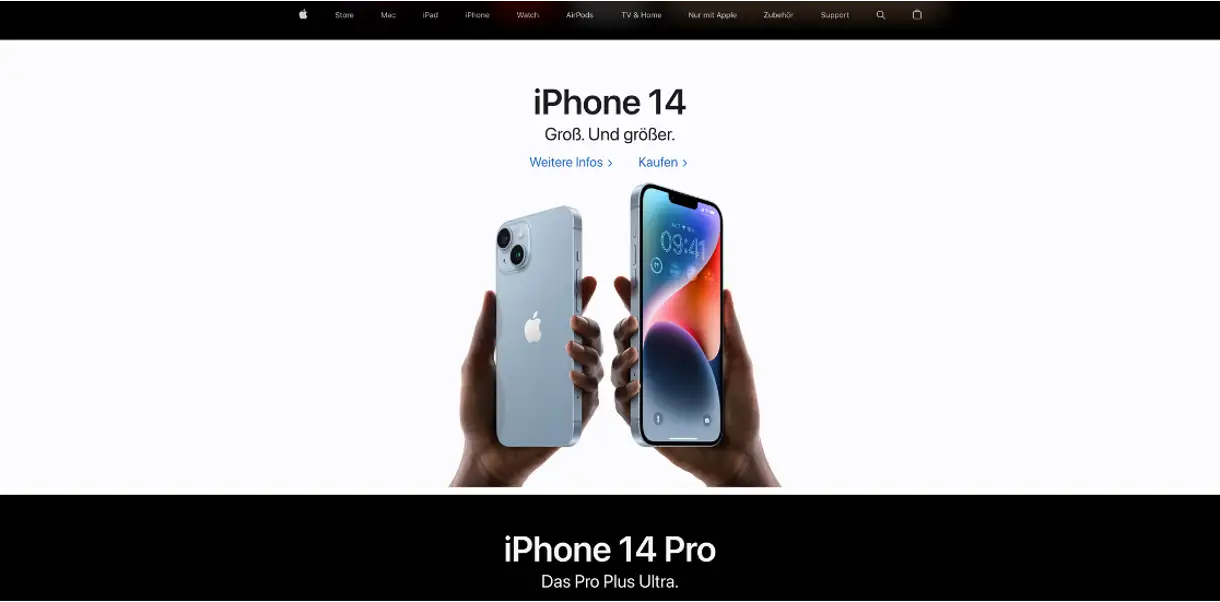
The home page of www.apple.com as an example of minimalist web design.
3D Models

3D models can create a higher level of visualization and thus understanding.
3D models replace 2D-images and -videos so that users can better integrate themselves into the virtual world. For example, in online stores it’s possible for users to get a better impression of the products. 3D models can interact with digital content to a new level. Integrating 3D elements such as products, buildings or landscapes into websites can create an engaging and realistic user experience. The models can be interactive, for example zoomable and rotatable by the users. Another advantage of 3D models is that a complex content can be presented in an understandable way. A 3D model can visualize a product and its functions as well as components better and more comprehensibly than a simple photograph or a 2D-drawing.
Microanimations
A micro animation of the website smashmallow.com
As the name suggests, microanimations are small animations. But in this case, small does not mean insignificant. Microanimations are extremely helpful when guiding users through the website and drawing attention to certain elements. They can also add a playful element to the website. Microanimations have been popular for a few years now, but this year will be all about using them organically. A big advantage in using microanimations is the increased interaction rate. Microanimations reward users, for example, by having an animation appear when they click on a certain button. The users feel a kind of reward and want to repeat the process. This action-reward-relationship can be used as a technique to increase interaction. Interactions in web design that take place between the users and the interface are, for example, feedback when clicking, loading indicators, hover effects and scroll effects.
Page Load Speed
Page load speed measures – as the name suggests – how fast the content on your website loads. In other words, it’s the time it takes to fully display the content on a page. It can also be referred to as “time to first byte”, which is the time it takes for the browser to receive the first piece of information from the server. Page speed is very important because websites that load quickly naturally deliver content faster. Thus, they better meet the needs of the modern users. For this reason, page load speed has been used as a ranking factor for many years. Its importance is increasing from year to year. Originally, page load speed was just a metric to determine how quickly users could access page content. In the meantime, however, it has become an important indicator of the user-friendliness of a website.
Adaptive Design
Adaptive design is not fluid design. Instead of changing the screenlayout to fit each device size, it defines a static, fixed layout that adapts to the screen size. Adaptive websites are optimized for the best user experience – they load faster and use images as well as menus that are optimized for mobile use. A prominent feature of adaptive design is the layout of the website that’s optimized for different mobile devices. This ensures the consistency of the website on all devices. Thus, size and design of the images are adjusted to the size of the device and provide the ideal viewing experience to the website visitors.
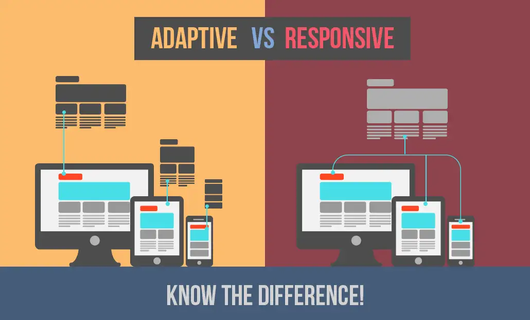
The difference between adaptive and responsive design. Display of www.clariontech.com
Quellen:
- https://electricenjin.com/how-to-hyper-personalize-your-customers-experience-in-the-digital-marketing-space
- https://merehead.com/blog/graphic-web-design-trends-2023
- https://codegoda.io/
- https://www.apple.com
- smashmallow.com
- https://www.theedigital.com/blog/web-design-trends
- https://dribbble.com/shots/16265014-Delight-3D-and-Animation-for-Smart-Home
- https://lead-online.de/magazin/webdesign/webdesign-trends-2023/
- https://www.smarterdigitalmarketing.co.uk/page-speed-vs-web-design-how-to-do-both-right/
- https://www.clariontech.com/blog/responsive-vs.-adaptive-website-design-know-the-difference